
Client project
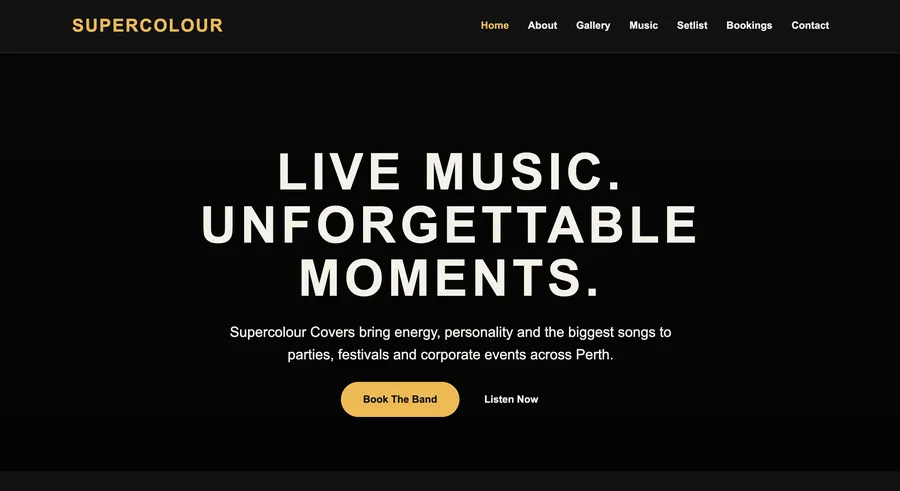
Supercolour
An events business that was losing corporate enquiries to a dated site. We rebuilt it around booking intent. Clear packages, real photography and one obvious next step.
Client sites and product concepts. For each, the interesting part isn’t the visual style, it’s the constraint we were designing against.
An events business that was losing corporate enquiries to a dated site. We rebuilt it around booking intent. Clear packages, real photography and one obvious next step.
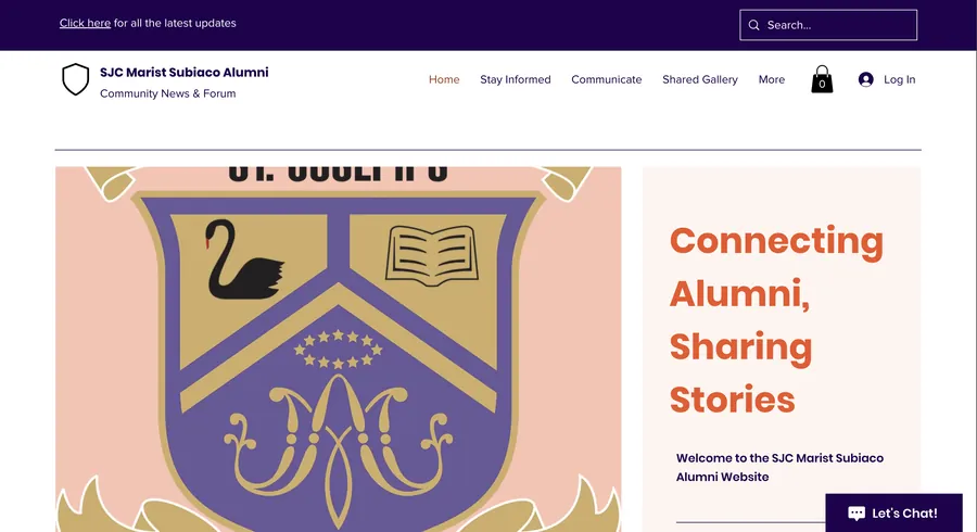
An alumni association with decades of history and a website that hid it. The rebuild put events, news and membership within one click of the homepage.
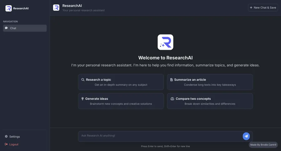
A concept for an AI research tool. The brief was trust: explain a complex product without jargon, and make the interface itself the strongest argument for it.
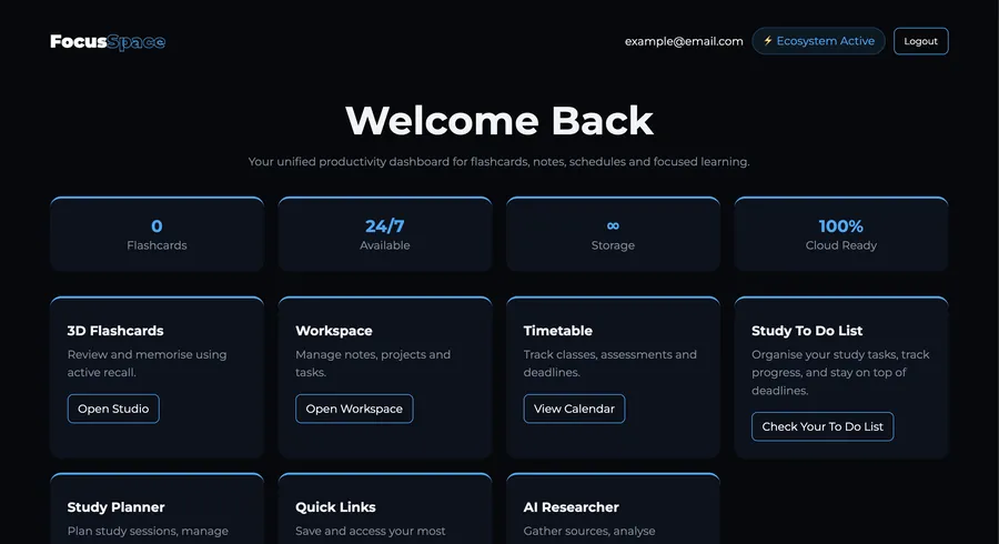
A productivity platform concept built around one question: what does the person need on screen right now, and what can wait? Everything else was cut.

A discovery site for a fandom that already knows what it likes. Dense, fast, and designed to survive a lot of browsing without feeling heavy.
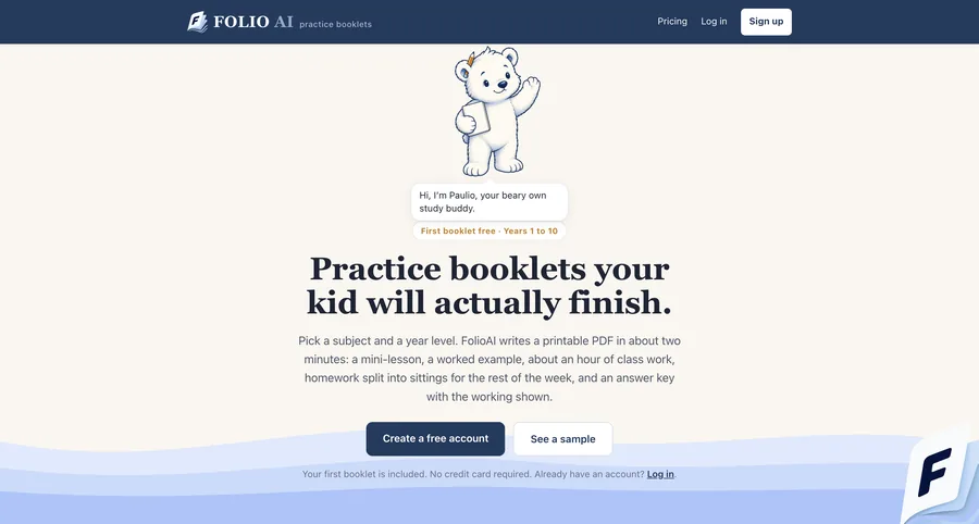
Printable practice booklets for Years 1 to 10, generated on demand. The brief was speed to value: land, describe what you need, get a booklet, with nothing else in the way.
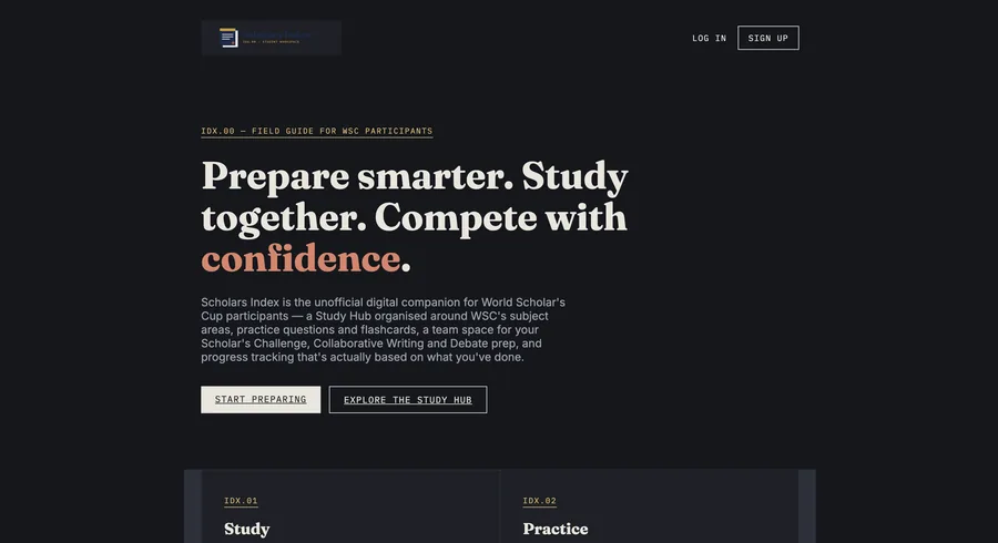
A study and team platform built for World Scholar’s Cup competitors. The challenge was structure: a lot of material, a lot of teams, organised so nothing gets lost between them.
Whatever the industry, these are non-negotiable, they’re the difference between a site that looks fine and one that works.
Tested from a small phone up to a wide desktop, including the awkward sizes in between.
Real heading order, descriptive metadata, sensible URLs and image alt text on every page.
Keyboard navigation, visible focus states, readable contrast and respect for reduced-motion settings.
Compressed images, deferred scripts and no framework overhead the site doesn’t need.
Send the brief, even a rough one. We’ll come back with an approach, a price and a realistic timeline.